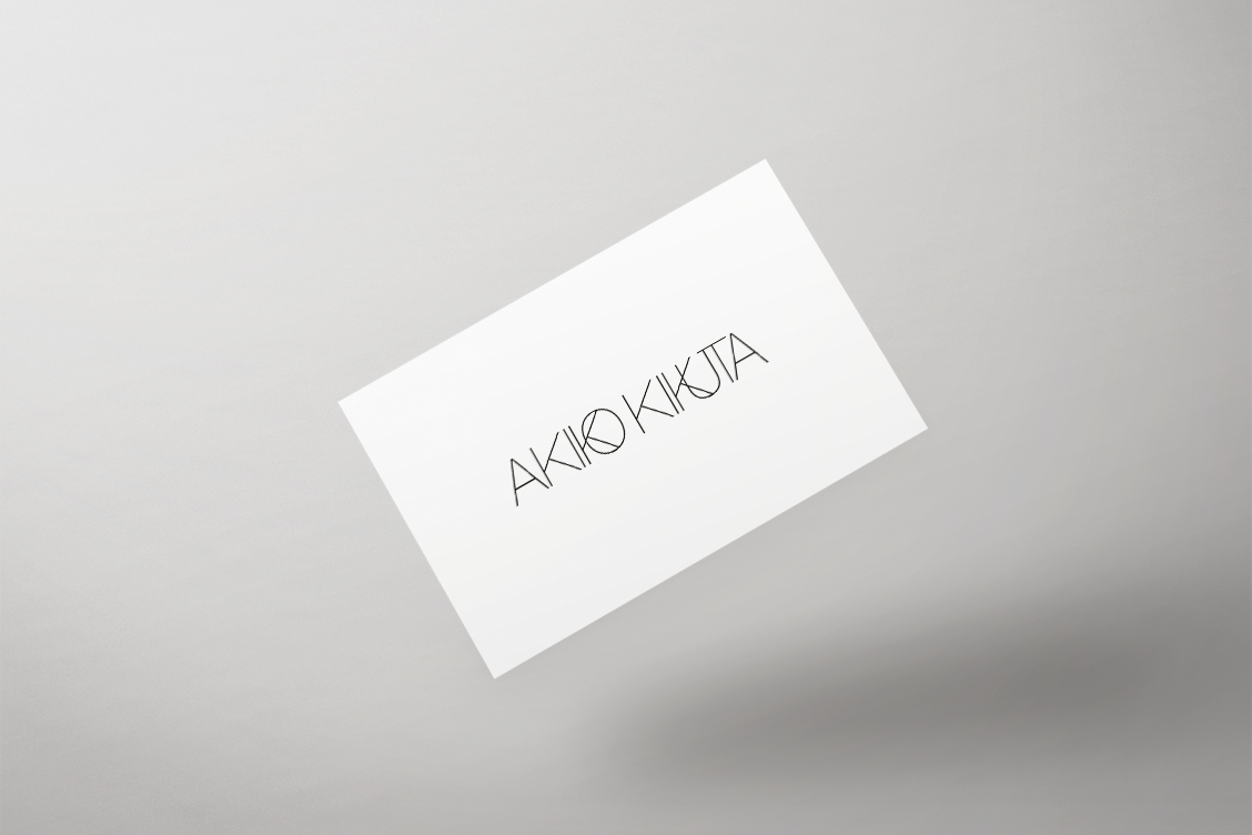
Identité visuelle pour Akiko Kikuta Ltd.
Identité visuelle pour Akiko Kikuta Ltd., société d’import/export de millésimes anciens et vins rares basé à Paris et Tokyo.
Visual Identity for Akiko Kikuta Ltd., rare vintage wine import/export company based in Paris and Tokyo.
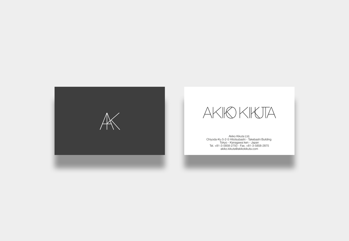
Akiko Kikuta Ltd. is an independent wine and spirits import/export company specialised in great wines, collectables bottles and rare vintage wine from France.
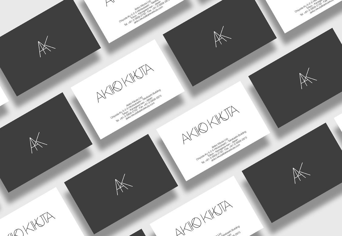
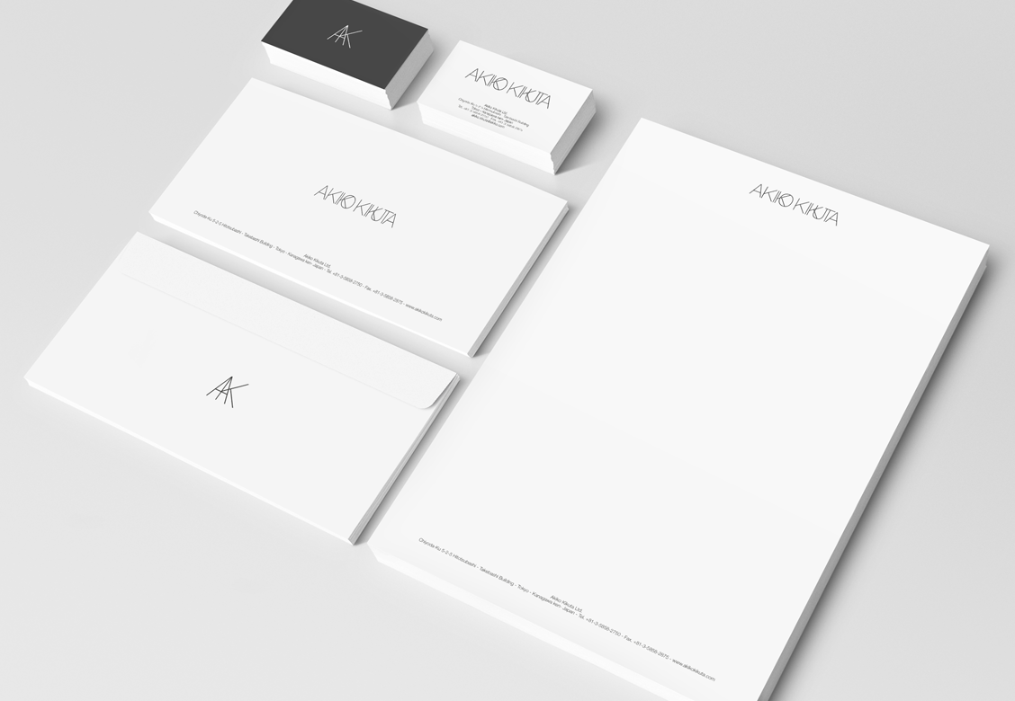
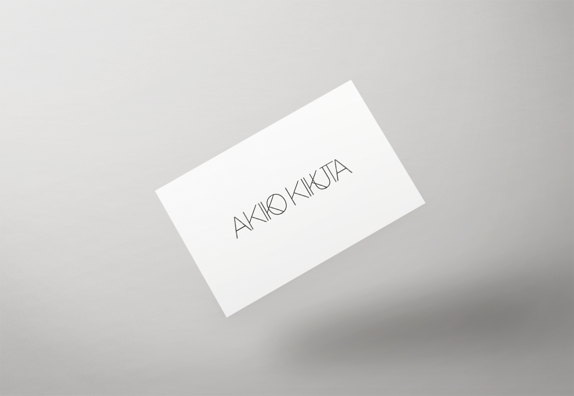
The company needed a luxurious energy and a timeless image in their visual identity. Ultra light font emphasize an high end aspect to the logo as well as a knowledge the wine industry. Black on white helps to defines the luxurious identity of the company.
LOGO ICON CONSTRUCTION AND SYMBOLISM
The icon for the logo was built with the two initials letters A and K from the name Akiko Kikuta. The association of both letters represents the marketing relation between both cities, Paris and Tokyo. A stands for paris. K stands for Tokyo. The merging of both letters into one icon symbolize the commercial association of both cities. Associated together the symbol represents as well the Eiffel Tower and the Tokyo Tower. Two symbols of the cities.
ClientAkiko Kikuta Ltd.ServicesIdentité VisuelleAnnée2022